Nissan Accessories: Reimagining the parts & accessories shopping experience
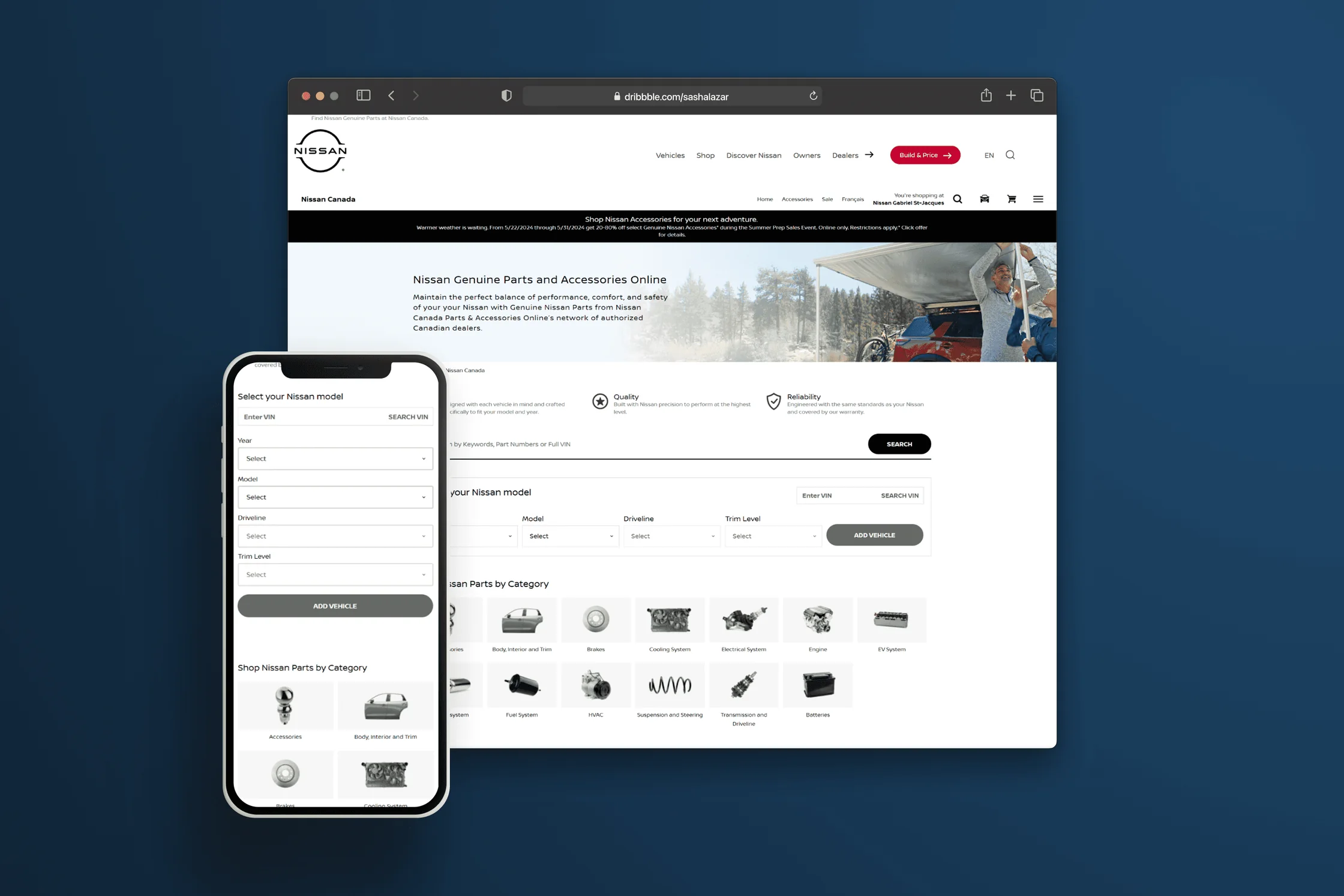
UX design for Nissan’s global parts and accessories e-commerce platform, delivered with SimplePart.
Overview
A catalogue of thousands of parts and accessoriesfor a multitude of Nissan models and versions
Creating a simple and easy to use shopping experience was our top priority. This project refined the existing experience to ensure customers feel confident when browsing and purchasing products.
- 11
- Best-in-class e-commerce experiences studied
- 3
- Journey maps of how customers buy parts and accessories
- 5
- Improvements made from our recommendations
Context
My role in the teamRepresenting Nissan inside a partner’s platform
The platform
SimplePart partner with many automotive OEMs to provide a platform and operational service for the parts & accessories e-commerce experience. This means that the designers responsible for the global template, used on all Nissan websites worldwide, work at SimplePart.
My role
My role as UX designer on the project was to represent Nissan, advocating for our users and business objectives to ensure they come through in the SimplePart design.
Since this is a platform used by multiple OEMs, we faced several challenges:
- Technical feasibility
- Time vs effort
- Conflicting business interests
As well as bringing my expertise as a designer to the table, my skills in articulating decisions with conviction, prioritising requirements and maintaining positive client relationships were essential for this project.
The Brief
Balancing customer and business needs
The project’s goal was to leverage existing platform investments to deliver a hybrid, technical solution for Nissan’s Parts & Accessories platform, prioritising customer experience without sacrificing business needs.
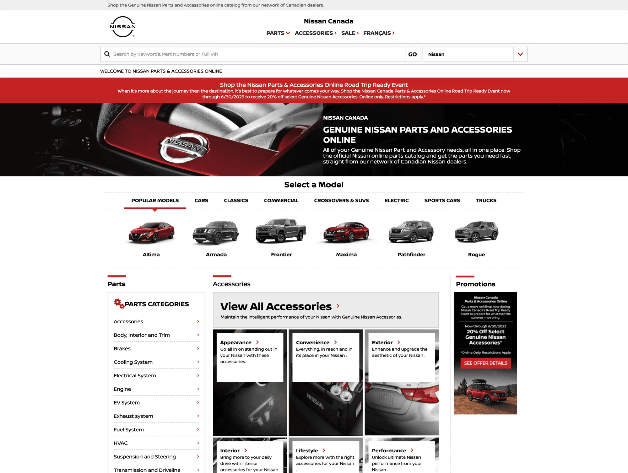
Current design. The live site we started from.
Design approach
The process of enhancing the experience
Firstly, we assessed the existing website and identified key areas that needed improvement, then prioritised them by severity of impact on the user experience. This exercise formed the basis of the recommendations we provided for the SimplePart designers and guided the changes that needed to be made.
- Step 1
Audit
Conduct competitor analysis and audit existing site
Analysing best-in-class e-commerce experiences helped us to identify areas of concern and opportunity with our existing user journeys. This was communicated to the client in the form of workshops and PDF reports to use for reference.
- Step 2
Recommend
Make recommendations to improve current experience
Recommendations were made on how to improve several aspects of the experience to address user pain points.
- Step 3
Oversee
Oversee design process and sign off final designs
The design process included many push-backs and compromises in order to find the best solution that meets user needs, but also goals of both businesses.
Competitor analysis
We studied 11 competitorsand their best-in-class e-commerce experiences

Journey mapping
Identifying customer needsand areas of opportunity
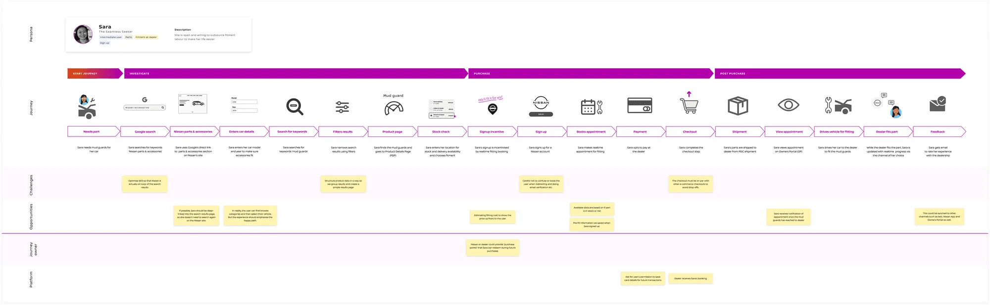
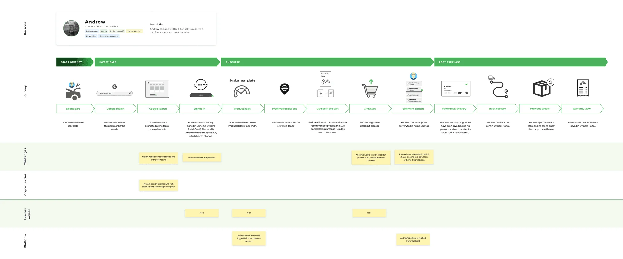
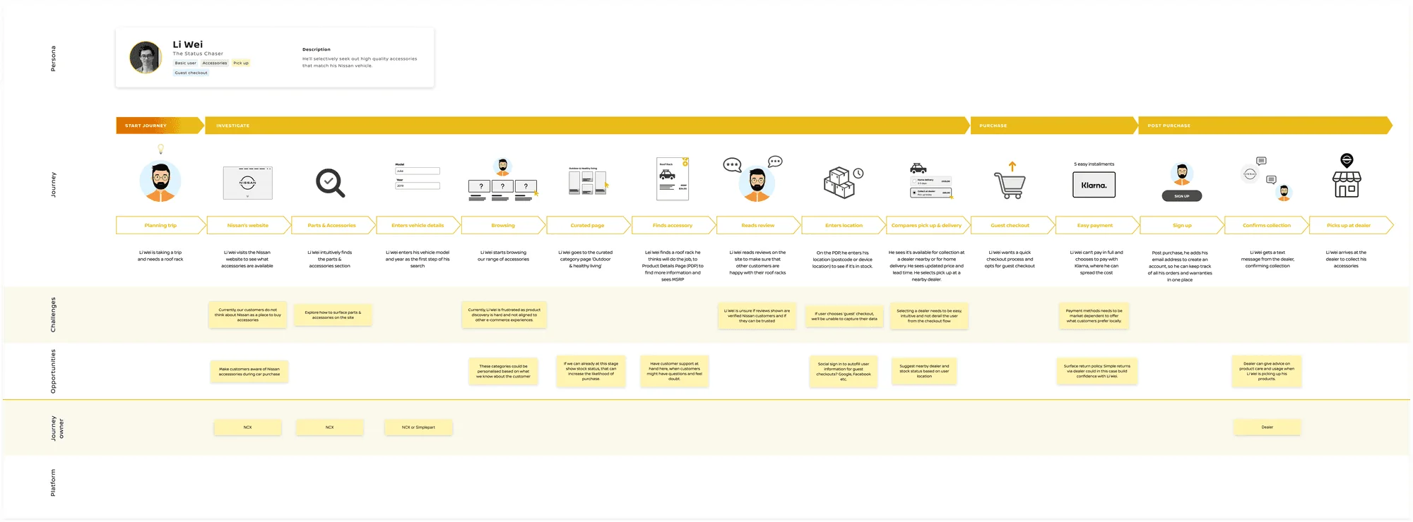
We created 3 journey maps to visualise the steps our customers take to purchase Nissan parts or accessories for their vehicles. This allowed us to take a deeper look into our customers’ needs and identify the challenges to solve and new opportunities for design.
Opportunities
We made design recommendationsbased on the insights gathered from research
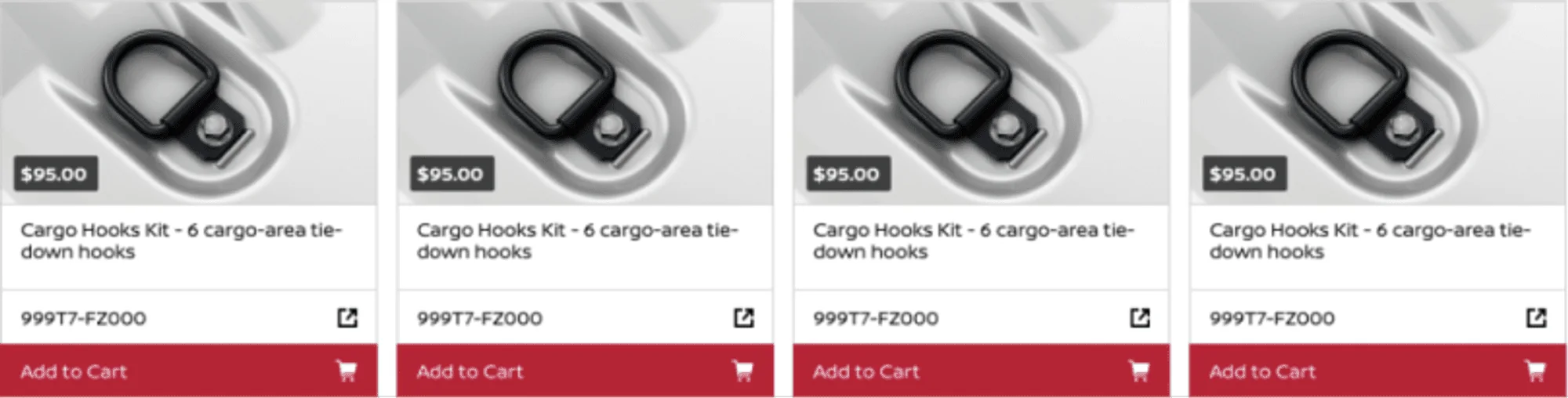
Pain point
In order to see more about the item, the user has to click on the part number, which isn’t in line with expectations.
Opportunity
Make the call to action clearer and easier to scan so that users can make decisions quickly and with less cognitive strain.
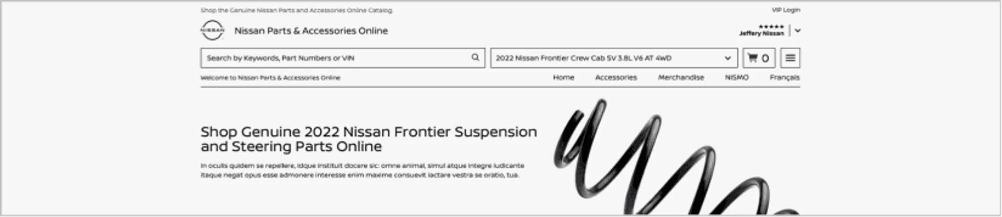
Pain point
It’s difficult to distinguish between the different elements in the header, adding to the user’s cognitive load when they try to scan for a particular function.
Opportunity
Enhance the header to make elements more visually distinct and easy to understand, whilst still maintaining functionality.
Final design
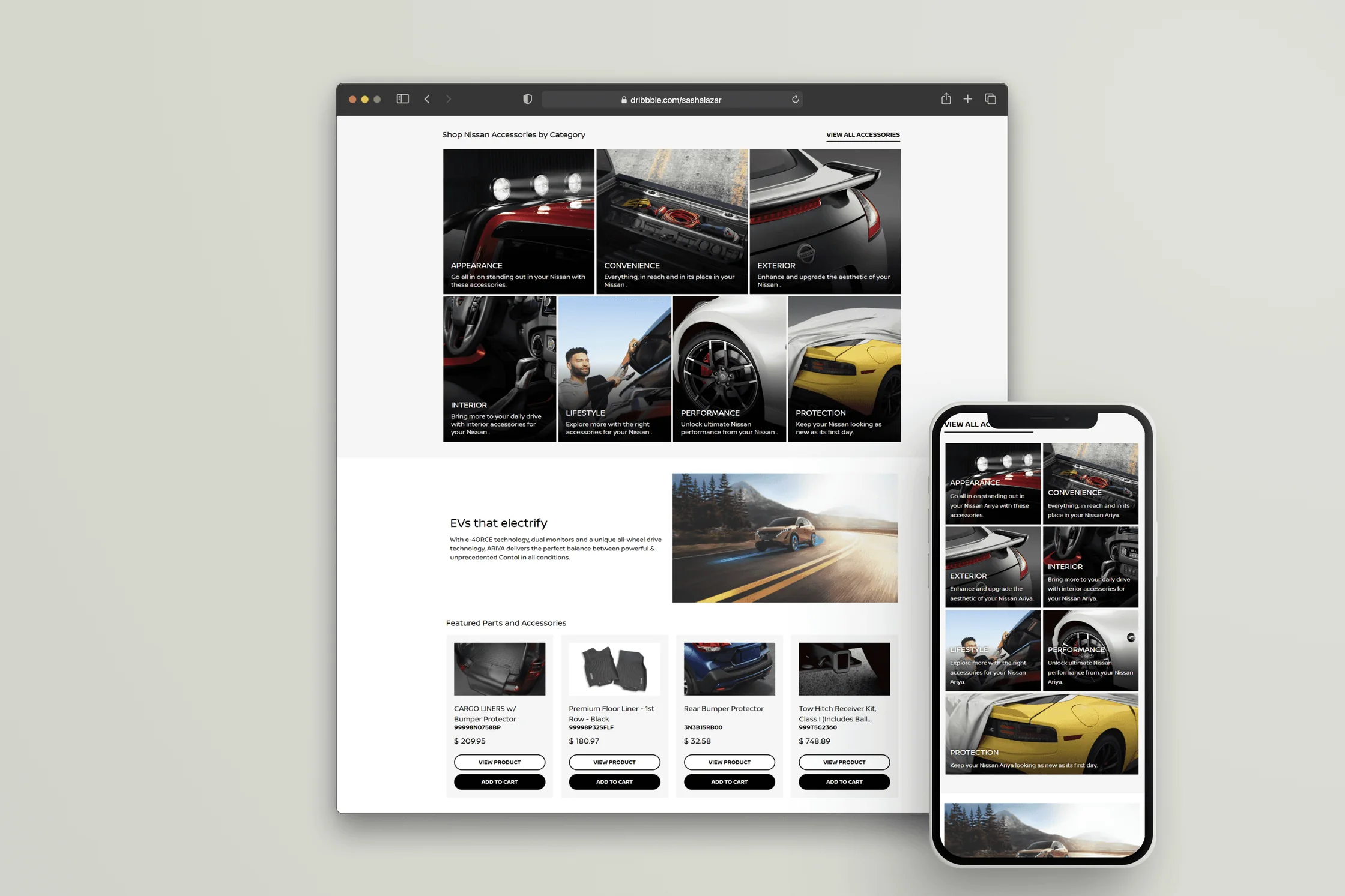
An improved user experienceacross the global template
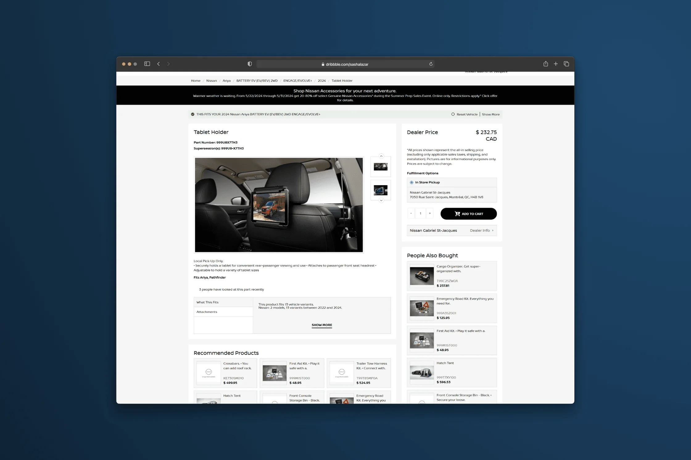
Project highlights
Improvements based onour recommendations
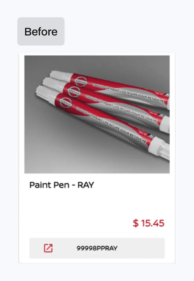

01Meaningful calls to action
On the live site, the ‘featured products’ cards were outdated and not very easy to understand. One of our greatest concerns was using the part number as the call to action label, a decision made by SimplePart to boost SEO, but one that poses several experience and accessibility problems.
After a lot of discussion on the matter, the Nissan team were able to successfully convince SimplePart (most importantly, the CEO) to put experience at the heart of the product. My role on this journey was to provide evidence and justification for more meaningful calls to action, and do so with conviction in high-pressure meetings.
02Recognition rather than recall
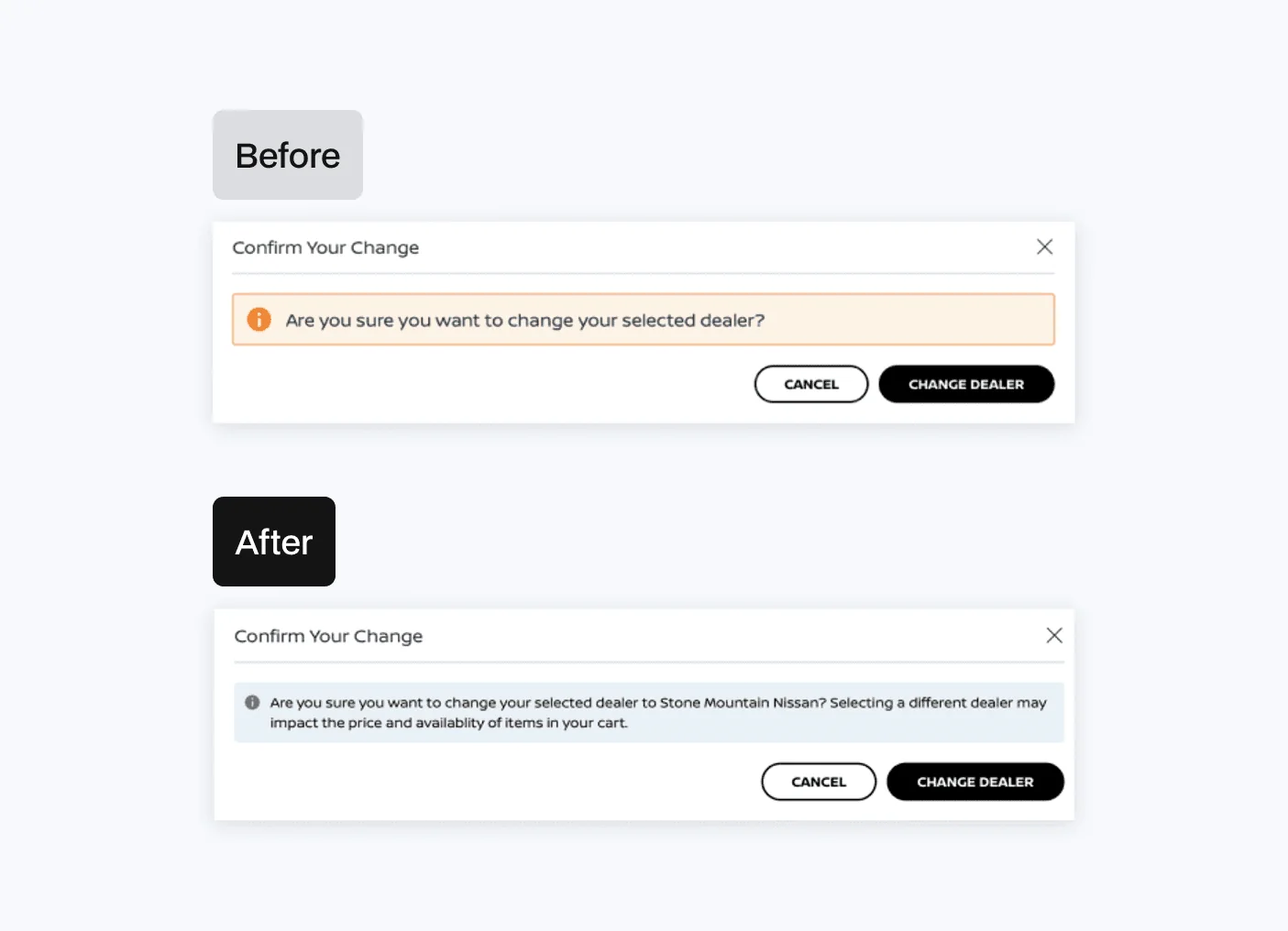
Users shouldn’t have to rely on their memory when completing tasks using web interfaces, as this adds to cognitive load and creates greater chances of error.
In the example below, the first WIP design for changing your dealer from one to another was purely a notice to confirm the change. Adding dynamic text here to replay the new dealer to the user before making the selection, and highlight other important information that may impact their decision, means the user is completely informed and therefore in control. This helps to minimise error and reduce task time.
03Optimised header
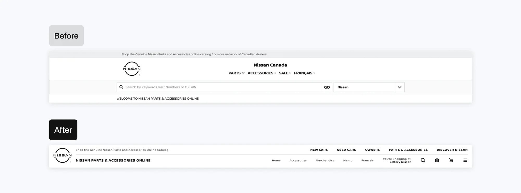
A requirement for the new technical design was to implement a Nissan Global header along with the SimplePart e-commerce platform header, evidencing benefit for both business cases.
A stacked header with additional functionality enables users to easily access frequently-used pages on the website. Going with a more compact design does not distract from the primary browsing experience, but is still visible to the user.
04Frictionless vehicle selection
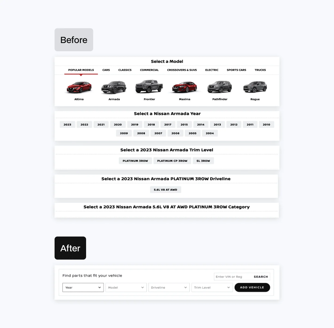
The vehicle selector in the live site was clunky and required the user to make 4 different selections, refreshing the page each time. Further, there was no option to backtrack to adjust previous selections or easily change the vehicle once it had been selected.
Simplifying this experience by providing dynamic drop-downs allows the user to provide the same information with a lot less friction. A cleaner interface also speeds up the process, as the user is familiar with the design pattern after completing the first field. A second option to type in their VIN (registration plate) gives the user freedom of choice, which reduces the number of steps needed to achieve the same outcome.
05Accessibility guidance for developers
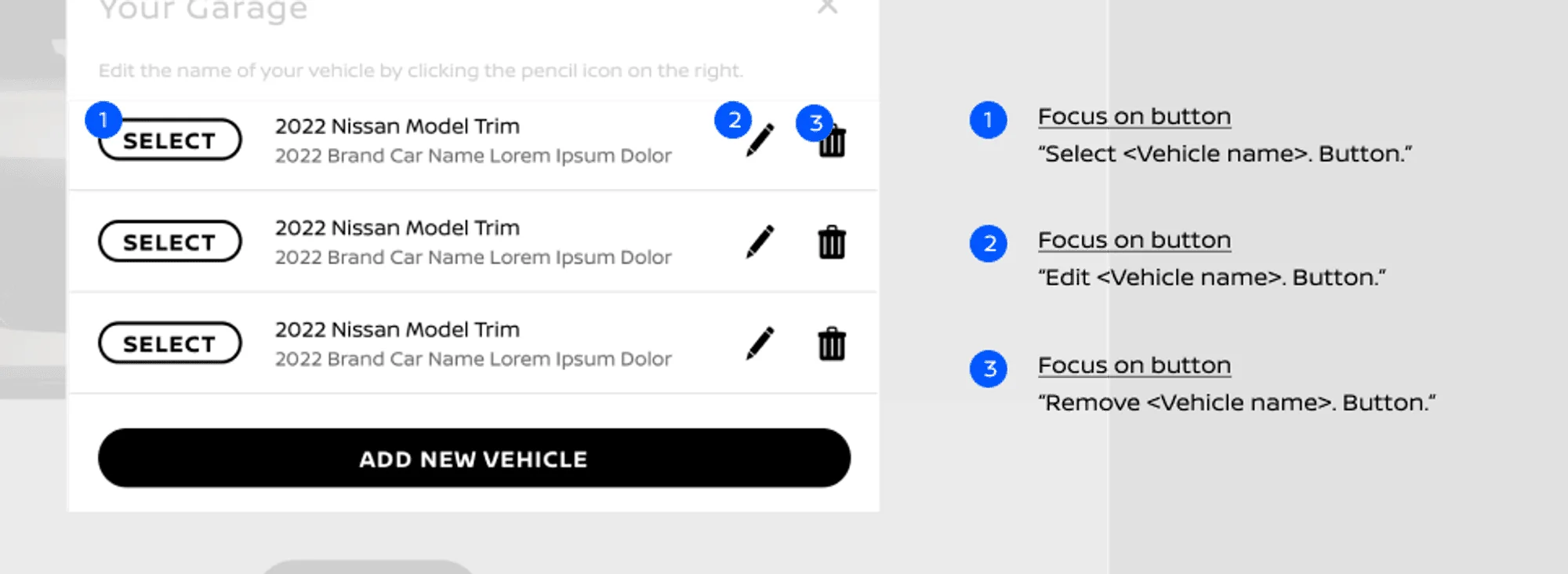
In some cases, our design suggestions could not be implemented due to the rigidity of the SimplePart platform. Focus order in the example below was a key concern, as the screen reader didn’t provide any context when focused on the ‘select’ button.
By providing accessibility documentation for components that need additional consideration, we can ensure that users with additional needs can still experience the website in a meaningful way.